My role
UX/UI Design, Prototyping
Platform
iOS, Android
Tools
Sketch, Framer
Timeline
June 2017 - Sept. 2017
Background
A large majority of MailChimp’s users are small business owners. They spend most of their time managing stores, orders and products. They have little time left for marketing. Not to mention that most of them are not experts in marketing. Therefore, they are expecting MailChimp to give them marketing suggestions and remind them when to take actions.
This is where the resend to non-openers feature comes in. Being prompted at the optimized timing based on MailChimp’s data research, users can resend emails to their non-openers to maximize the impact of their marketing campaigns. This is a low-hanging fruit for the busy small business owners. And what’s better, they can do this in one single step on mobile.
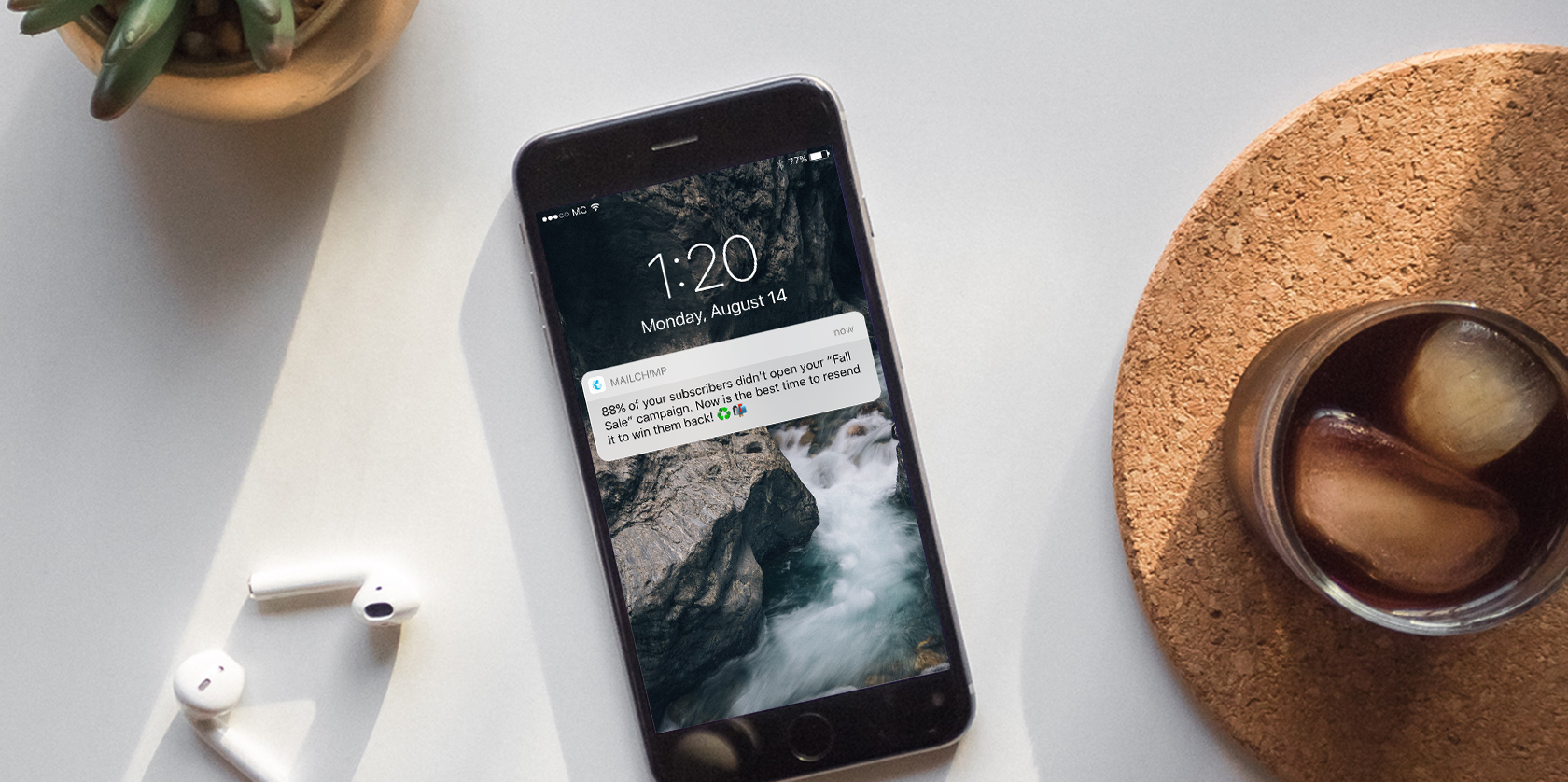
For the early stage, we conducted internal stakeholder interviews, paper prototype testing, data research and secondary research online. We learned that —
- 1.
The best timing to resend an email was within 24 hours. This time frame had the smallest negative difference between the original and re-sent campaign's stats.
- 2.
Users liked the concept of resending to non-openers, but they didn't feel comfortable with just pressing a button without previewing the campaign. Some users said they would want to change the subject line if the original campaign’s open rate was too low.
- 3.
Some users were concerned that their subscribers would feel spammed if they saw the emails twice. They were concerned about unsubscribes.
Design
From research, we came up with three main strategies —
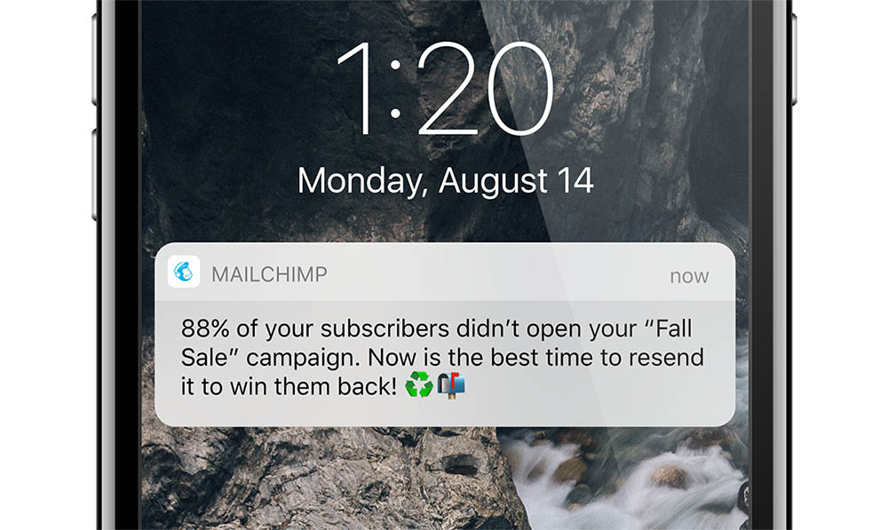
#1 Using relevant data to inspire action
The motivation for users to resend is to improve their open rates, especially when the open rates are lower than what they expect. Including the open rate in messages at the entry points not only provides useful data for users but also tells them why they want to take action.
NOTIFICATION
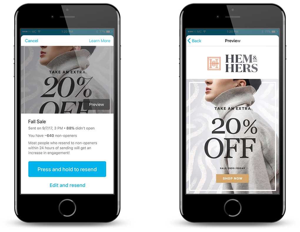
#2 Preventing errors & assuring users
There’s a balance we need to strike between efficiency and error-proofness. Users should be able to preview and confirm before they hit the button. They should also be able to edit the campaign before they resend.
LANDING PAGE & PREVIEW SCREENS
#3 Increasing discoverability with multiple entry points
Users have different ways of achieving their goals. Apart from mobile notifications, we designed two in-app entry points from the campaign details and report details screens.
FLOWS FROM DIFFERENT ENTRY POINTS
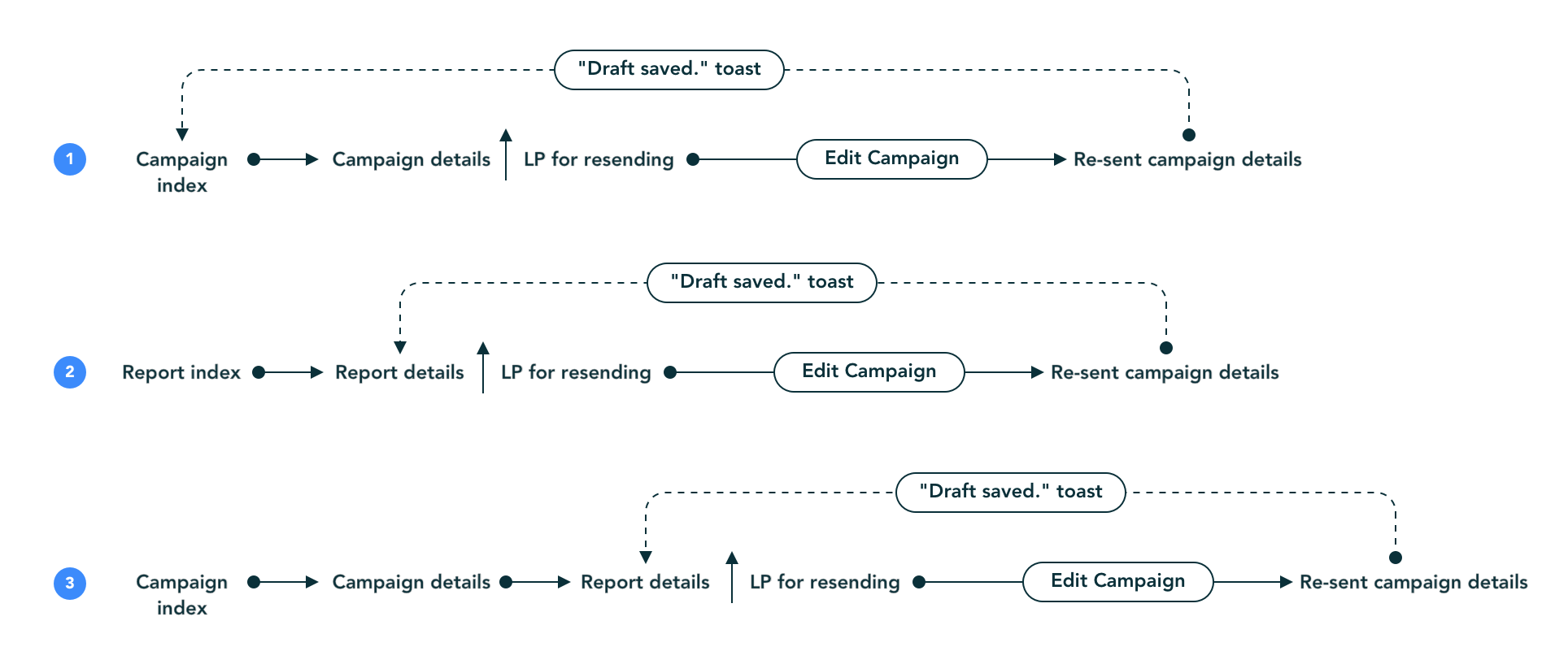
- 1.
Mobile notifications. Since the performance of re-sent campaigns depends on timing, mobile notification is the best way to remind users. To make sure the reminder is not annoyingly frequent, we only remind users when their campaigns’ open rates are lower than their list averages, and the valid recipients are more than 10% of the original recipients. We also set the trigger timing to be 23.5 hours after the original campaign is sent. It's not only because our data research indicates this timing has the best results, but also it fits a user’s routine best.
- 2.
Report details. One of the advantages of using the mobile app is that users can track their campaigns’ performance on the go, especially if it’s within 24 hours after a user sent a campaign. Including the entry point on reports page not only gives the feature high discoverability, but it also aligns with our first strategy — be relevant.
ENTRY POINTS FROM CAMPAIGN DETAILS AND REPORT DETAILS SCREENS
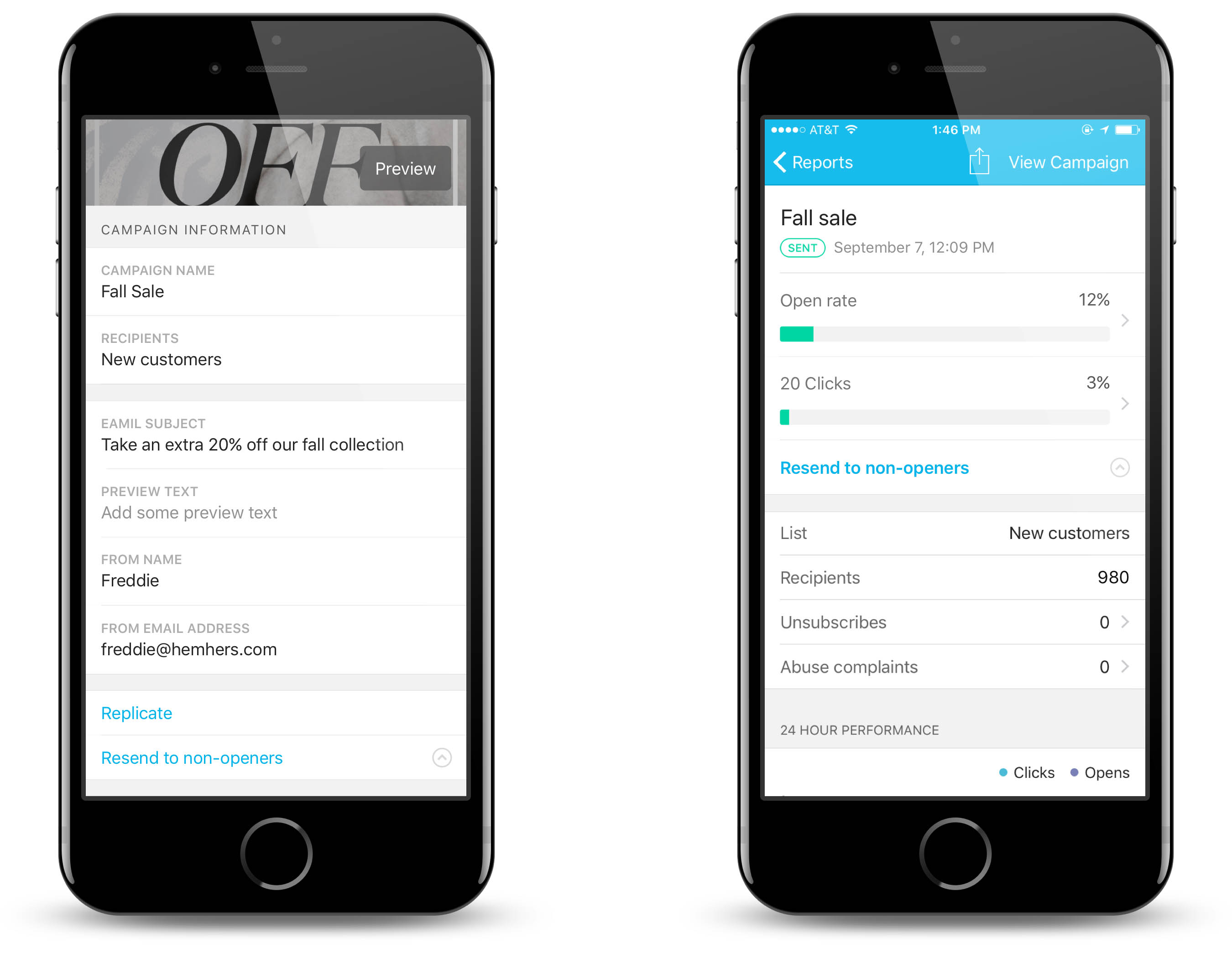
- 3.
Campaign details. In the early stage of research when we were testing paper prototypes, we asked users where they’d expect to see this feature on mobile. A majority of them told us that they would go to the campaign details page, replicate the campaign and set the segment as subscribers who didn’t open. This workflow is what they learned from the web platform, and users tend to assume a similar pattern for mobile. We take this into consideration and include the third entry point on campaign details page, right next to the “replicate” button.
COPY VARIATIONS BASED ON TIMING AND ENTRY POINTS
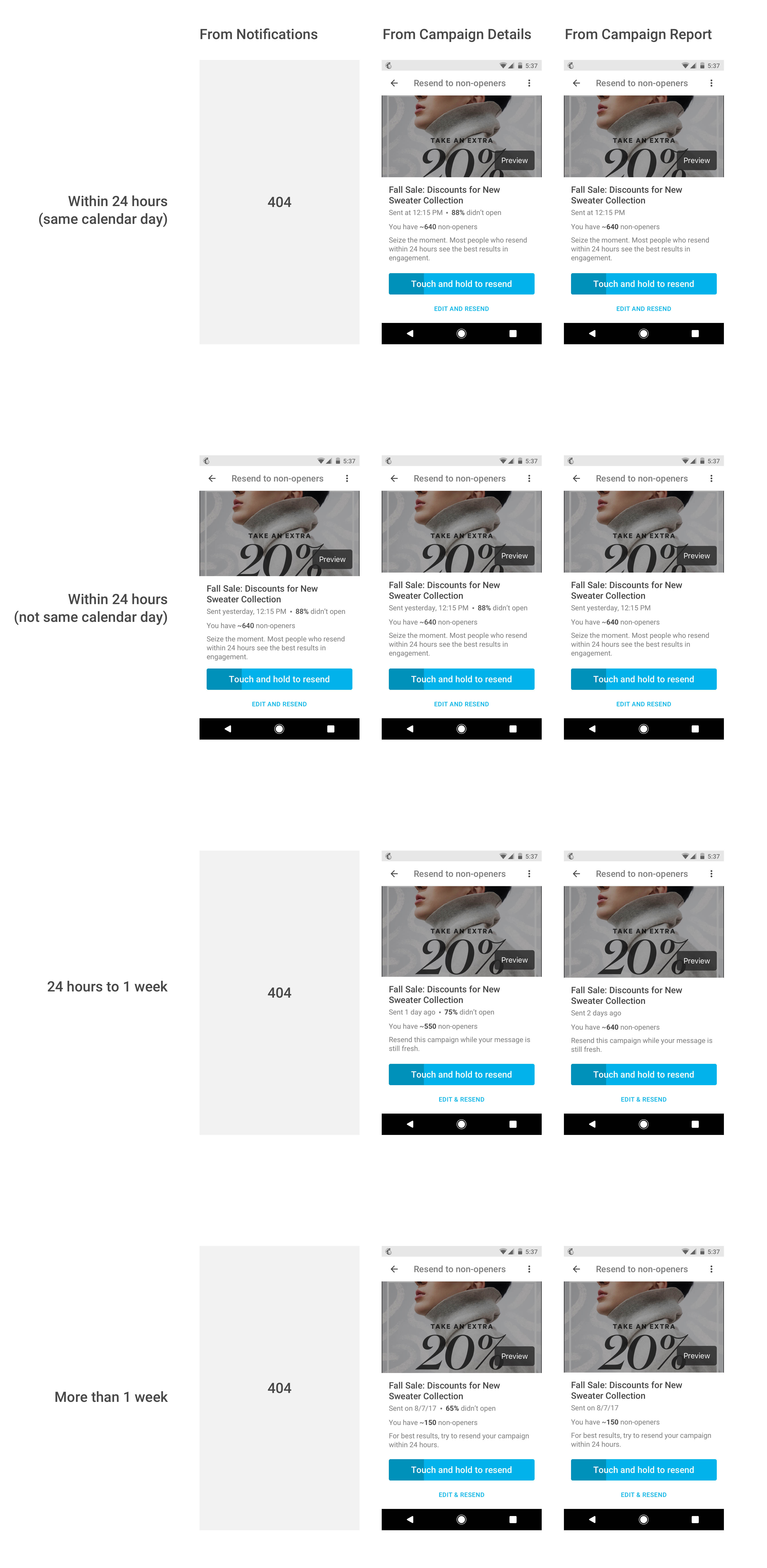
Results
The feature has great performance data (which I cannot reveal) and is being very well-received by our users. They have tweeted about how much they love using it. Reading these tweets is the best moment for me. 😌
#EmailMarketing tip for those using @MailChimp - you need try the "Resend to non-openers" function if you haven't already. One button push from your reports on the app, and I'm getting a consistent 10% lift in open rates.


@MailChimp now lets you easily resend emails to people who didn't open them and I have never been more jazzed about an in-app feature.
#EmailMarketing tip for those using @MailChimp - you need try the "Resend to non-openers" function if you haven't already. One button push from your reports on the app, and I'm getting a consistent 10% lift in open rates.
This project cannot be so successful without Chad Urbanick (Design) and Jud Vaughan (Research). I miss working with them! 😭
