My role
UX/UI Design, Prototyping
Platform
Mobile
Tools
Sketch, Framer
Timeline
April 2018 - August 2018
Background
The problem
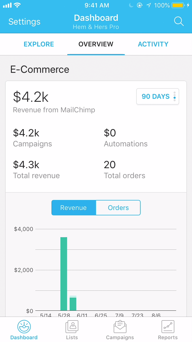
Our original mobile homepage was a long page with a lot of data points and charts, and the engagement on the page was low. A majority of our users skipped it and went directly to the other tabs. And the dashboard is an important page seen by every mobile user as soon as they log in. We want to improve the front door of our mobile app to better serve users’ needs.
THE MOBILE HOMEPAGE BEFORE REDESIGN
Our users
Our users are busy small business owners, and they are not experts in marketing. They believed that they weren’t using Mailchimp to its fullest potential, and they wanted us to give them prioritized, personalized and achievable actions.
Key question
How might we surface the most relevant information to Mailchimp users on the mobile homepage?
Scope
Redesigning the mobile homepage and the related child pages on both iOS and Android apps.
Research
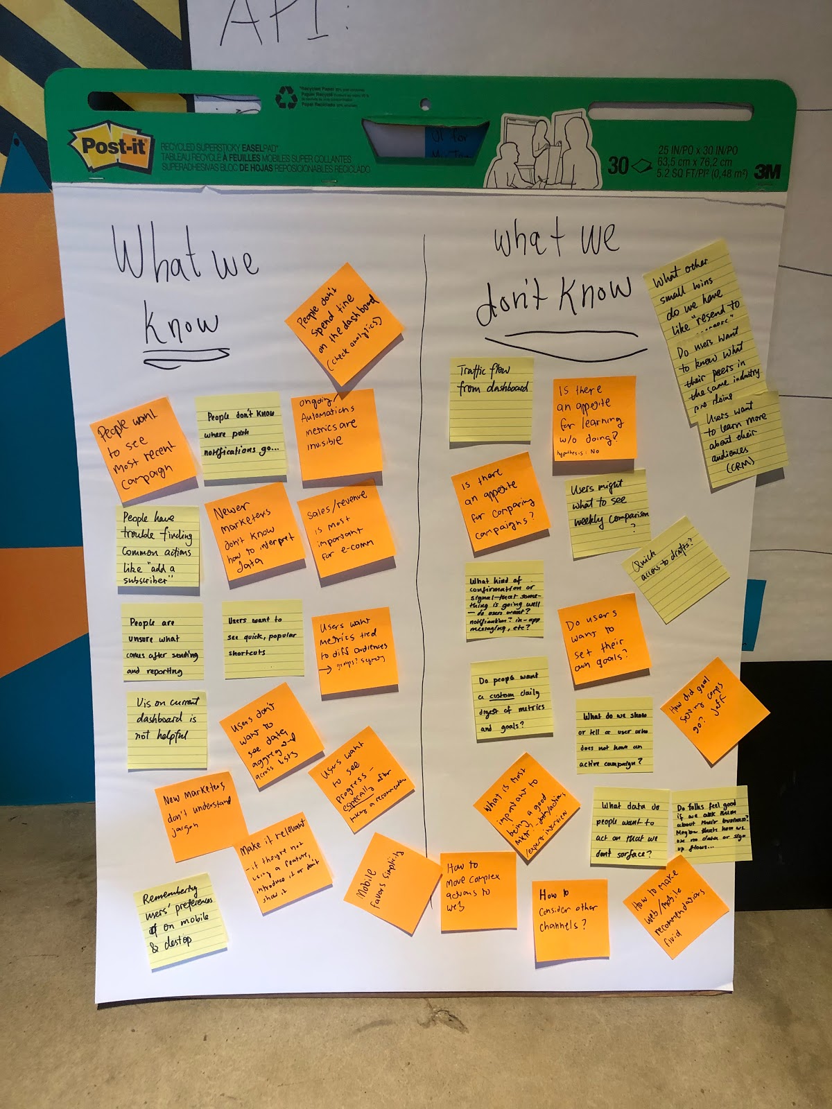
Starting the project, we explored the problem space by reading research documents about the original dashboard, and then we aggregated our knowledge and questions into these two columns — what we know and what we don’t know.
WHAT WE KNOW AND DON'T KNOW
We then conducted interviews with our internal client success team to learn more about the best marketing practices. Here are the three most important takeaways about what users expect to see on the mobile homepage:
- 1.
The most recent campaigns. One of the biggest advantages of using a mobile app is that users can check their campaign performance at their fingertips. Users want to know updates about their campaigns soon after they send them.
- 2.
Ongoing campaigns. Ongoing campaigns are the campaigns that are constantly active, contrary to a regular email campaign that usually lasts for 48 hours. An ongoing campaign can be an automated email, a landing page, or an ad. Since it has a much longer life span than a regular email campaign, most users often forget about the ongoing campaigns after they set them up, but they want to be reminded of the ongoing campaigns’ performances.
- 3.
Digestible and actionable data. Instead of just seeing the numbers, users want to understand the “why” behind data, and how they can improve it if the performance is not ideal.
Now that we know what users want to see on the mobile homepage, we narrow down our key question to:

Design
Principles
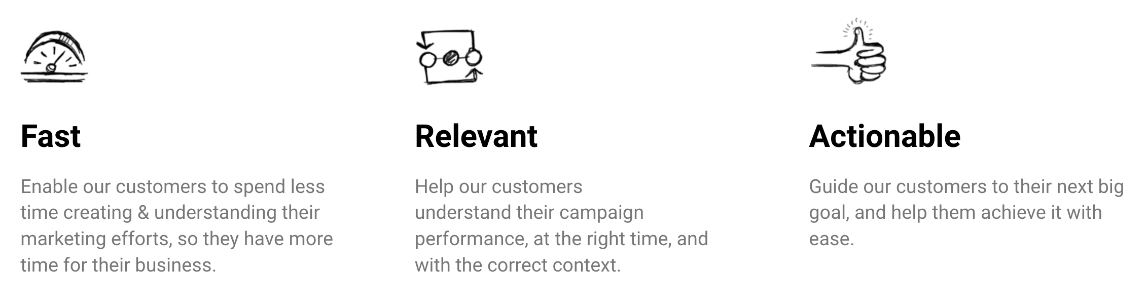
Before we started the project, we created three design principles that guided the design decisions —
We invited our cross-functional team in the brainstorming session. After a lot of discussions, we arrived at these three vastly different concepts.
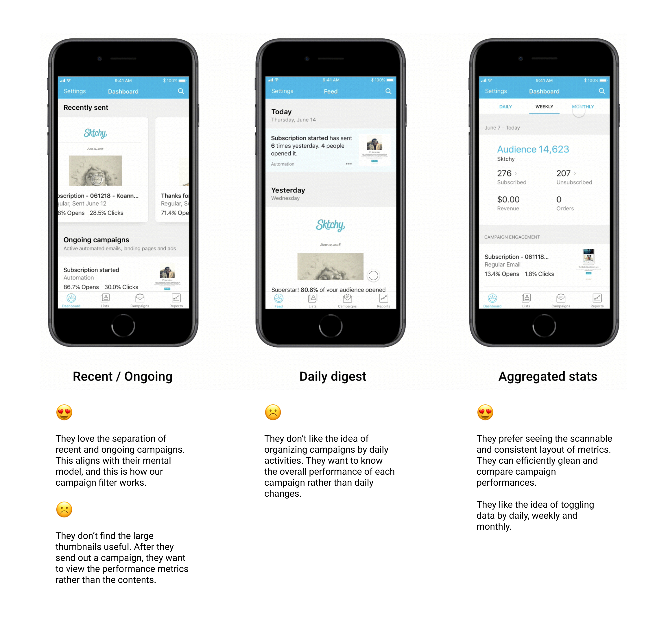
Concept testing
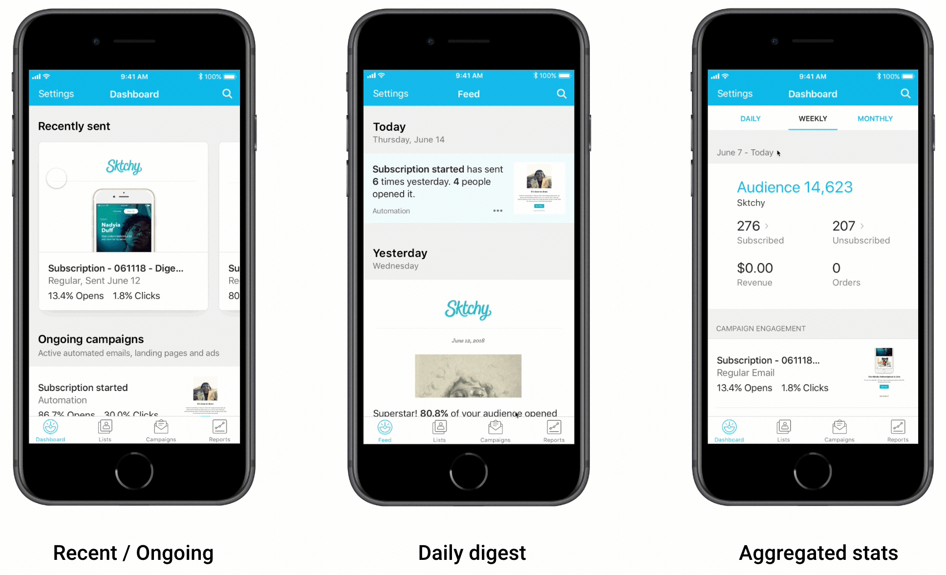
- 1.
Concept 1 - Recent / Ongoing. Separating the recently sent campaigns and the ongoing campaigns into two sections, and we use different layouts and interactions for these two types of campaigns.
- 2.
Concept 2 - Daily digest. Organizing all of the campaigns based on daily updates. It’s similar to a news feed where users can learn about recent changes brought by their marketing campaigns.
- 3.
Concept 3 - Aggregated stats. Showing the most important aggregated data first, and the contributing campaigns below that. This is the closest version to the original dashboard. Instead of removing all data points on the dashboard, we want to see if a condensed version of metrics will be useful to users.
When we tested these three concepts, we didn’t ask users “Which one of the three versions do you like best?” Instead, we compared and evaluated each component within the three versions. And these are what we learned from the user testings —
Now we had a much clearer idea of what we wanted to include on the homepage, we moved to our next task — defining the key metrics. We used a combination of interviews and surveys for card sorting. We asked users to select their top 10 metrics and then choose 5 out of 10. After that, we compared the results and found out that the most important metrics users care about are quite common.
Both e-comm and non-e-comm users care most about the total number of subscribers, unsubscribes, open rates and click rates. The only difference is that e-comm users think that total revenue is the most important metric.
Having nailed down all the information necessary for the homepage, we shifted our focus to the visual presentation.
VISUAL DESIGN EXPLORATION
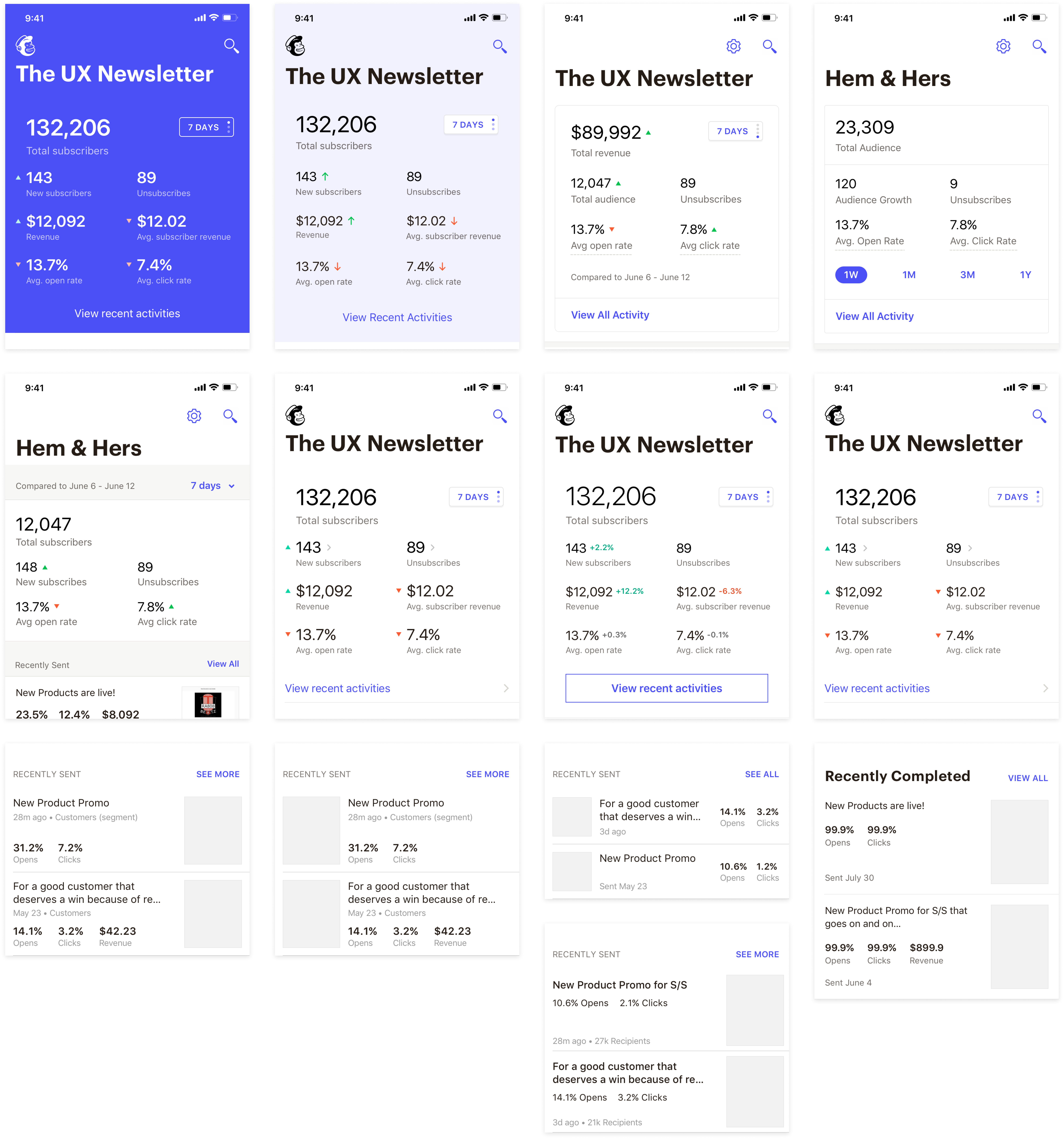
Note: To hide the new Mailchimp branding before it's released, the fonts and colors were replaced.
Final design (Main pages)
MVP - Homepage
Fast. Enable our customers to spend less time navigating in the app or looking for what they need.
Relevant. Surface the most relevant information users expect to see when they open the app. Provide contexts about data.
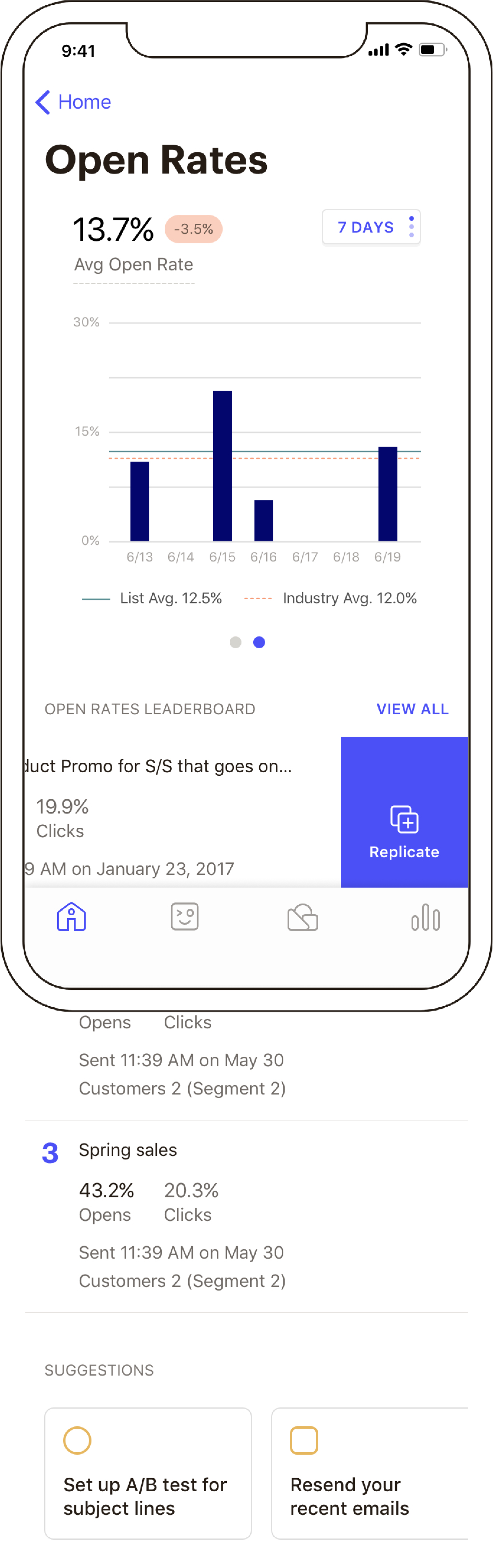
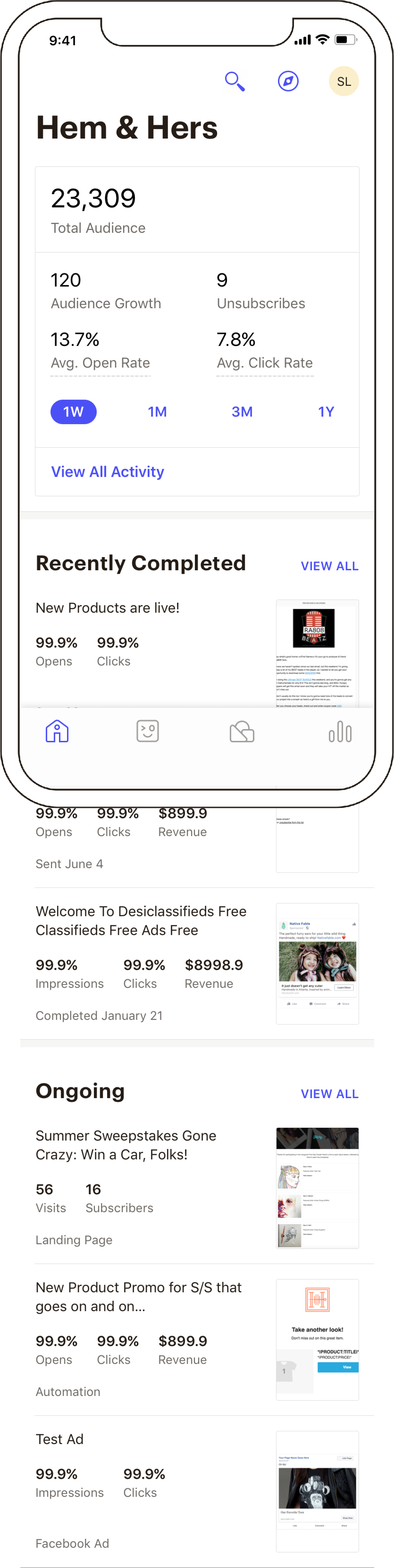
Concept - Metrics' details page
Actionable. Guide our customers to their next big goal, and help them achieve it with ease.
Note: To hide the new Mailchimp branding before it's released, the fonts and colors were replaced.
Results
I left Mailchimp for the West Coast before this redesign was launched at the beginning of 2019. While I don't have data on the results, I believe it's achieving what it sets out to accomplish — providing users with the information they care about the most on the go. The app store rating has risen from 3.7 to an astonishing 4.8 —— Well, this is definitely not solely due to the homepage redesign, but tons of other efforts invested in the mobile app.
What I learned from the design process is that if you get your cross-functional team to care about the same thing as you do, your life is going to be so much easier. 🥰
Special thanks to Celeb Andrews (Design) and Jud Vaughan(Research). I had tons of fun working with these two talented guys. ✨
Thank you for reading this much! Let’s talk if you have thoughts, feedbacks or suggestions!